
Dan Picked wine subscriptions

Wine subscription service launched to 500,000+ My Dan's members. I designed the end-to-end customer experience and an internal portal for staff to curate monthly selections.

Client
Dan Murphy's
Timeline
2021–2022
Dan Picked wine subscriptions

Overview

The surge in online ordering during COVID-19 created an opportunity for Dan Murphy's to reimagine how customers discover wine. The business wanted to deepen engagement with its My Dan's loyalty members through a curated subscription service, giving customers a reason to return each month while introducing them to wines they wouldn't normally choose.

As a design consultant from Contino, I partnered with the product manager to design the end-to-end experience across two audiences: customers subscribing and managing their account and internal staff curating monthly wine selections.

What we built

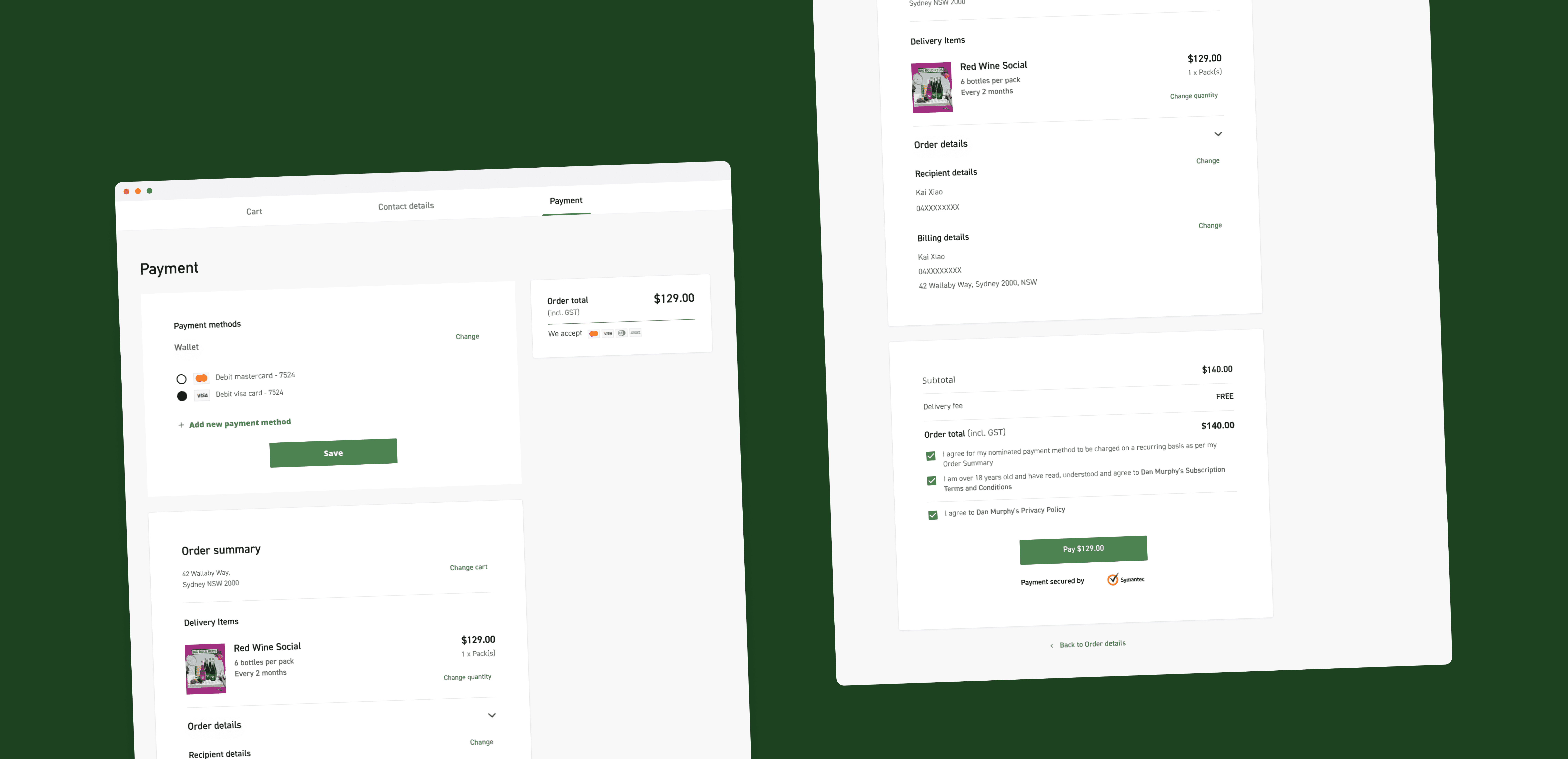
  • Subscription checkout wizard guiding customers through plan selection, delivery preferences and payment in a single focused flow
  • Digital wallet enabling users to save, switch and manage payment methods for recurring charges
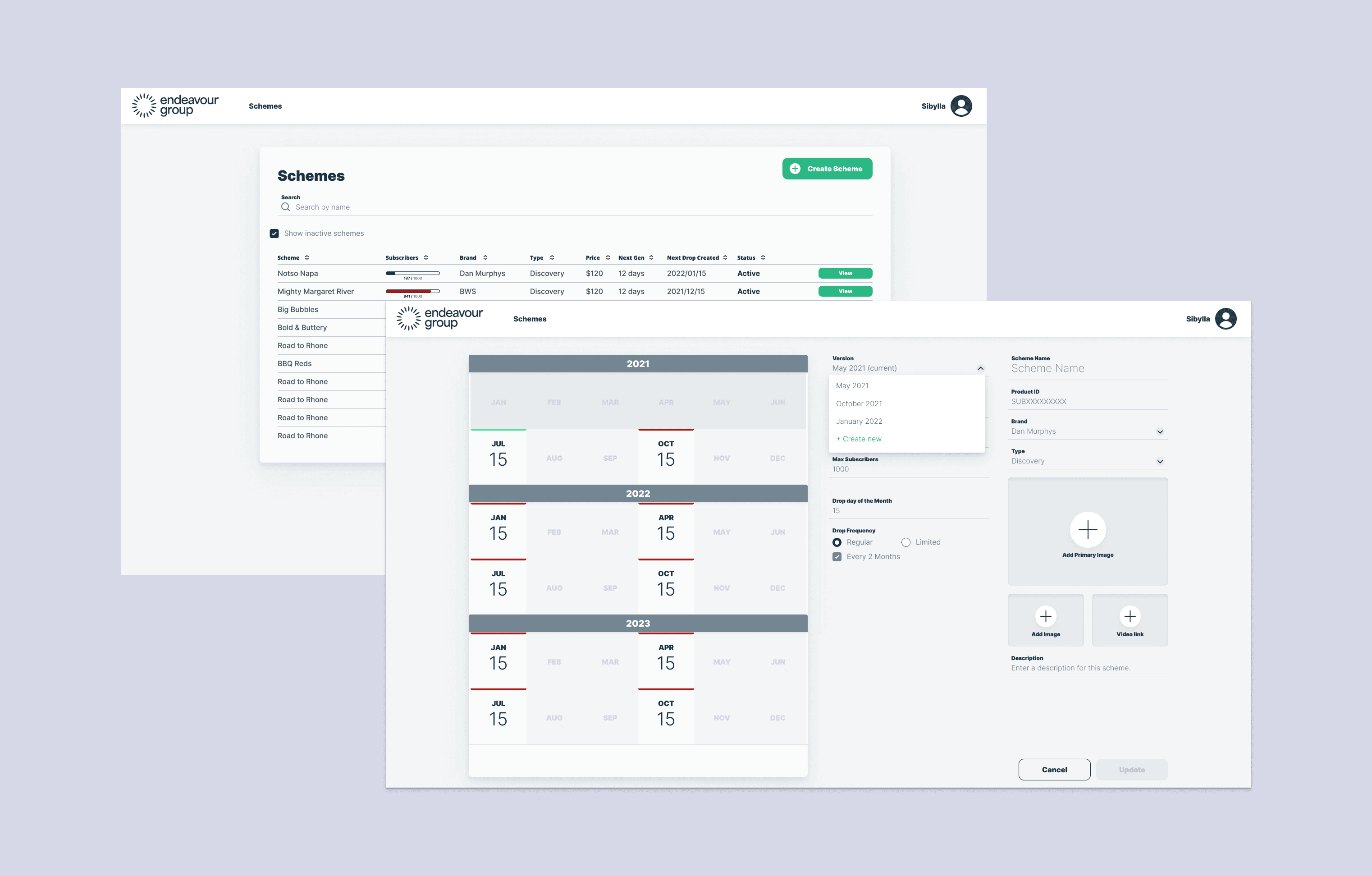
  • Staff curation portal giving the Dan Murphy's team control over monthly selections, descriptions and stock adjustments

Role

I owned the design process from early wireframes through to production specifications. I ran regular critique sessions with Dan Murphy's internal design team and presented progress to stakeholders fortnightly. I advocated for a phased release strategy, launching first to a friends-and-family group before the wider rollout to 500,000+ members, incorporating feedback iteratively to reduce risk.

Top

Challenges

This project operated under several pressures that shaped the design approach throughout.

Speed to market. The subscription needed to launch while online ordering demand was high. Every design decision was weighed against delivery timeline. This meant working closely with developers to understand what was feasible within each sprint and sometimes simplifying flows to ship a solid experience rather than a perfect one.

New payment platform. The business was integrating a recurring payment provider it hadn't used before. The checkout and wallet had to accommodate the platform's capabilities and limitations, which weren't always clear upfront. I worked with the engineering team to map technical constraints early so we could design around them rather than discover issues late in development.

Consultant access. As an external consultant, I had limited direct access to existing customer research and behavioural data. I leaned on the product manager and internal team for context and used stakeholder critique sessions to pressure-test assumptions I couldn't validate with data directly.

Two audiences, one timeline. The customer-facing subscription experience and the internal staff portal needed to ship together. Both had to work well, but the staff tool was at risk of being deprioritised. I made the case that a poor curation experience would undermine the quality of the customer-facing product.

Top

Designing the checkout

The core challenge was designing a checkout flow for a commitment that felt unfamiliar to most customers. Unlike a one-off wine purchase, a subscription asks users to hand over payment details for recurring charges with wines they haven't chosen themselves. The flow needed to build trust at every step.

Digital wallet and saved cards

The trickiest interaction design problem was the digital wallet. Customers needed to add, remove and switch between payment methods — but the mental model for managing saved cards in a subscription context is different from a standard e-commerce checkout. Users aren't just paying once; they're trusting that the right card will be charged next month.

I designed the wallet to make the active payment method visually prominent, with clear confirmation when switching cards. Removing a card that was linked to an active subscription triggered a warning and guided the user to select a replacement before confirming, preventing accidental failed charges. Each state — adding, editing, removing, switching — was mapped and documented so developers could implement edge cases consistently.

Subscription checkout wizard showing plan selection and payment steps

Wizard structure

I structured the checkout as a step-by-step wizard rather than a single long form. Each step had a focused task: choose your plan, set delivery preferences, enter payment. This reduced cognitive load and gave users a sense of progress. A persistent summary sidebar showed selections so far, reinforcing confidence as they moved through the flow.

The wizard also needed to handle returning users who wanted to modify their subscription. Rather than forcing them back through the full flow, I designed direct entry points to individual steps — change your plan, update delivery, swap payment — accessible from the subscription dashboard.

Design iterations showing checkout flow progression and refinement
Top

Designing the staff portal

The subscription's value depended on the quality of each month's wine selection. If staff couldn't curate efficiently, the customer experience would suffer — so the internal portal wasn't a back-office afterthought but a core part of the product.

What staff needed

Through conversations with the Dan Murphy's team, the clearest need was flexibility. Staff needed to swap wines in and out of a selection quickly — whether because of stock shortages, seasonal availability or a last-minute quality decision. The original assumption was a simple list-based picker, but feedback revealed that staff also needed to adjust descriptions, reorder selections and handle edge cases like a wine being discontinued after a selection was already built.

I designed the curation interface around a card-based layout where each wine in a selection could be individually edited, reordered, or replaced without disrupting the rest. A status indicator showed whether a selection was in draft, ready for review, or published, giving staff confidence about what customers would see and when.

Connecting the two experiences

A key design decision was making the staff portal preview match the customer-facing display as closely as possible. Staff could see exactly how their curation would appear to subscribers, which reduced back-and-forth with the product team and caught layout or copy issues before they reached customers. This tight feedback loop between the internal tool and the customer experience was something I pushed for early because it directly improved the quality of what shipped each month.

Top

Impact

Delivery

Over 8 months, the team shipped a complete subscription product — checkout wizard, digital wallet, recurring payments and staff curation portal — on schedule and within the market window the business needed. The phased release to a friends-and-family group before the full rollout caught usability issues early and gave the team confidence in the payment integration before it reached the wider member base.

Product quality

The digital wallet's handling of card management edge cases — switching, removing and replacing active payment methods — meant fewer failed charges and support tickets at launch. The staff portal's preview functionality reduced the gap between what was curated internally and what customers received, leading to faster monthly turnaround and fewer last-minute corrections.

Approach

Advocating for the phased release strategy and investing in the staff portal early were the two decisions that shaped the project's outcome most. Both required making the case to stakeholders that short-term effort would reduce long-term risk — a pattern I've carried into subsequent projects.

The launched Dan Picked subscription product
Top

Next project

Export Service

Let's connect

I'm exploring new opportunities and would love to hear about what you're building.